Post Date:
24 August 2025
Read time:
5
mins
The Trap of Form Over Function
I've spent my whole career looking at places like Godly, behance and Awwwards to get inspiration. Taking what I can from these incredible examples and implementing the little bits I can within the constraints of the agency world.
Traditionally, to achieve the level of interaction you see in most of these websites, you would need a top tier developer thats willing to help you in their own time (or pay them a lot of money). I've got close to starting this kind of thing with dev mates but in the fast paced world we live in, it's impossible to schedule free time together consistently.
Now in 2025, we are fully in the age of the website builder. Tools like Framer and Webflow have become so advanced, as a designer with a fairly good understanding of systems thinking, you don't need a developer anymore to build fairly incredible sites. Pair that with countless youtube videos, Chat GPT as your assistant and n8n/wordpress as your backend, you can do pretty much anything if you put your mind to it.
So, as you can imagine, I went to work. Planned out what I wanted to achieve, user stories, wireframes, Figma designs and prototypes, the normal process. Maybe a little too excited by the premise of Framer, I pushed through this phase very quickly. In my mind, I was focused on that holy grail opportunity, making one of those websites, the ones you see on the inspiration sites. This is an important oversight…
I worked on the build non-stop for about 8 days, from the moment I woke up, until the moment I went to bed, fueled by the dream of this flashy website that represents my brand. Digging into every little micro interaction, tailoring the scroll speeds, animating static graphics with AI for the most subtle of considerations. An eye blinking every 15 seconds that maybe 5 people would catch. Hiding little easter eggs in every corner. Then finally, after enough coffee to keep a sloth awake for 36 hours, it was done.
We launched it to our existing audience and it was received pretty well, kind of underwhelming, but it wasn't anything bad. We have a small, fairly loyal audience though, and got fairly regular visits. We managed to sell out our sticker pack through that website and traffic seemed to flow effectively, all be it fairly low.
We should note though, testing in an echo chamber is always going to give you extremely biased data. So, to test things out with unbiased users, I went to Reddit.
Oh boy was I in for an experience within that community.
I posted in 2 places, r/designcritique and r/streetwear startup. With a combined 17K impressions and 76 comments, it seems to at least spark conversation in these communities. Those comments though, they reminded me about the cost of not sticking to the process.
"Theres no actions for the users", "you lost me at blockchain", "you've done too much, make it simpler, don't take over the scroll", "the copy feels like AI slop", "Where's the fashion?"
Don't get me wrong, there was good feedback as well, but it was a wake up call. I'd fallen into the trap, form over function. No one cared about the easter eggs, the audience didn't appreciate the gaming background we had, and most importantly, I had not considered the audience we wanted to move into, I was too wrapped up in the audience I've been serving for the last 2 years.
So what do you do?
You go back to basics, strip away anything that is unnecessary and build up again, informed by the users you are building for.
Framer? Don't need it. Way too expensive for a few cool animations. So we switched to WebStudio which has an option to self host for free.
Animations? don't need them. Custom scroll timings? Gone. All the aspirational copy that was vague and useless? swapped for real people writing real stories.
It was time to let the content tell the story, the audience don't care about jargon and animations, they care about belonging, seeing their people looking cool and banding together to have a laugh. With that underpinning the approach, it was clear that a simple blog styled website that created a balance between powerful visuals and human stories was more aligned with the audience than flashy website.
It's heartbreaking in some ways to swap over to the new site, the old one I thought was really bloody cool. The problem was, it was for me and not our audience. We will be soon resharing it in Reddit, so I will update you all with the answer to the big question, did it work?
Either way, the foundation that's been built is now flexible enough to pivot as the data comes in.
Remember, as much as those sites we all look at are super flashy and aspirational, you've got to ask yourself, does that approach actually serve my audience? Or does it just look cool…
Let me know if you've fallen into this trap when you've had some freedom?
Thought
Up Next
Post Date:
24 August 2025
Read time:
2
mins
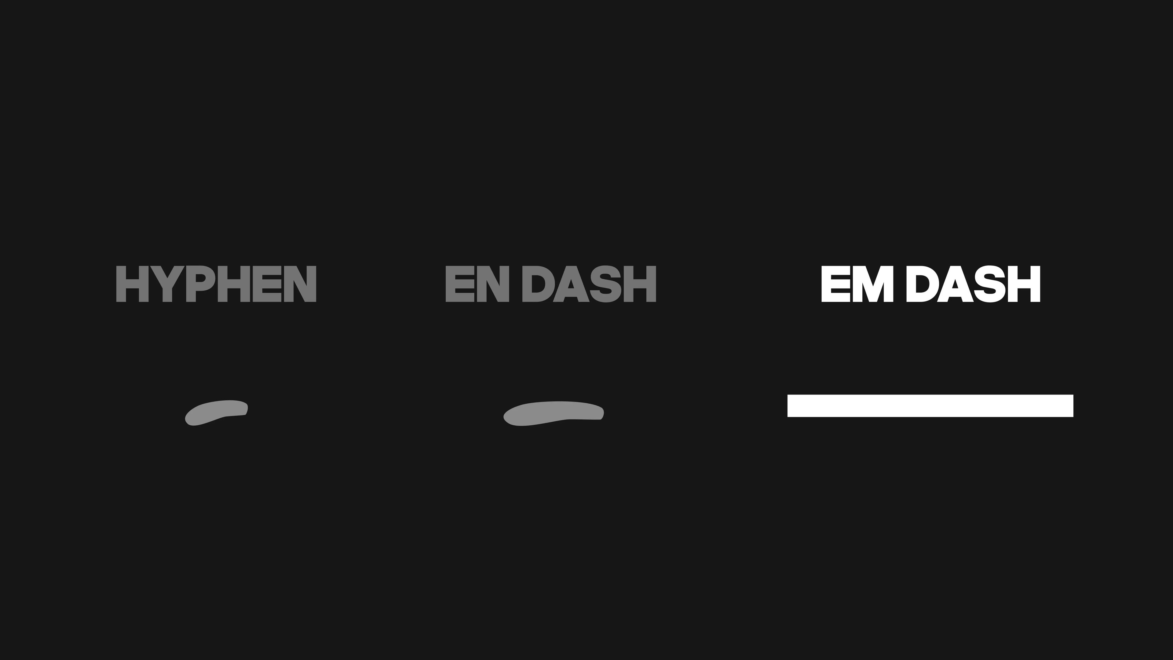
The Rise of the Em-Dash
The em dash has surged in popularity, often signaling AI-generated content. While not inherently negative, its widespread use may affect how authentic and human a piece of writing feels to readers.
Read the thought